When I took a course on group theory, my clever classmates would read the textbook, and a new abstract concept was theirs… they could fill in the examples of the groups themselves, and come up with new examples. I usually couldn’t do this. In order to generalize, first I had to work through all the examples in the textbook. Even then, the abstraction wasn’t guaranteed.
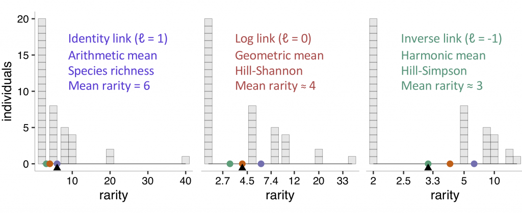
With diversity indices, I wrestle in a similar way. Learning that the control parameter in Hill Diversities “weights species abundances” differently, I had to draw a picture to see it. And I didn’t. But eventually I saw how the control parameter scales species rarities. In the MeanRarity R package we wrote some code to illustrate this concept, and invite you to play with our interactive tool yourself.